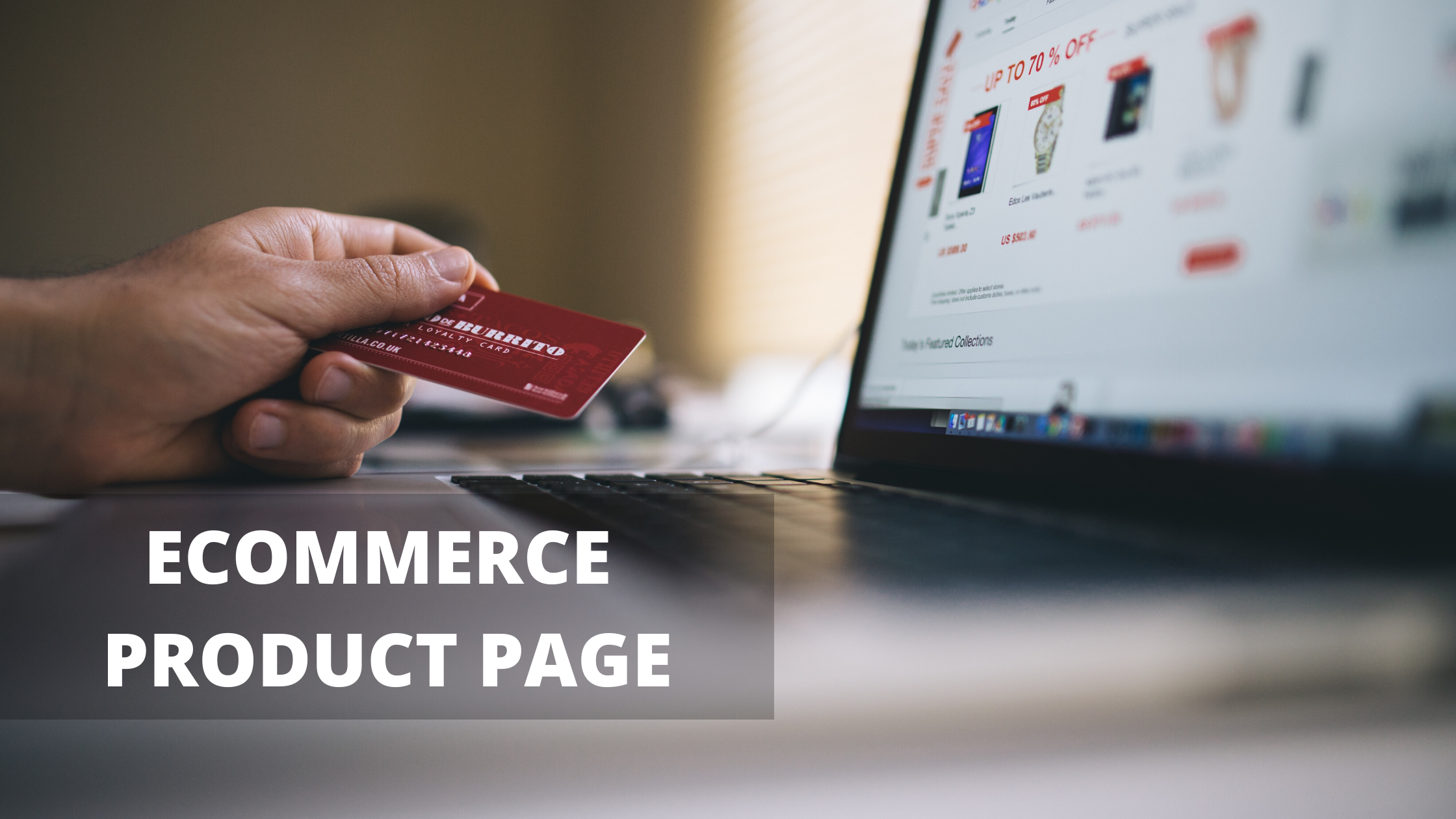
If you run an Ecommerce website, your product pages are the proof of truth for your business standards. Either they convert your visitor into an a lead customer or they make your business dislikes more. This is not new information and everyone knows that successful product pages are very important to a successful e-commerce website so why are there so many bad ones out there in the market in today's time?
Each visitor of your website that makes it to a product page represents the heavy lifting and money spent to get them there and the product page is not the time to squander that hard work. It is now totally up to you to create a user experience that gives the visitor an impeccable experience.
So exactly is the definition of a good product page user experience? Let's see, it is quite simple. A good user experience is the one that provides the information, assurances as well as motivation the visitor needs to become your customer. This definition will vary from website to website and industry to industry and hence, it is up to you to test and find the mix that works the best for your business type.
To help you get started with it, we asked the UX pros at digital-telepathy, a user experience design company, to rectify things you can do right now to improve the user experience of your product pages and below are some top ways to get more from your product pages and insight into what makes them work so damn well.
TIPS TO CREATE OUTSTANDING ECOMMERCE PRODUCT PAGE
- Prioritize imagery and video
Visuals are becoming an increasingly important part of the online experience in today's world and this can be attributed to the rise of social media platforms such as Instagram or Pinterest, that have dramatically changed the way we shop and view products online. A shopper is now making a decision to buy something based on one promoted Instagram post, images and videos and so it has become the most pressing concern for an eCommerce store looking to develop its ECommerce product page.
- Cut the clutter
Contemporary website design demands sleek, sophisticated and smooth user experience. That same theory should apply to your ECommerce product pages as well, in the sense that you should know what to put emphasis on and what clutter should be tucked away immediately.
- Consider the customer journey
Product pages are as much about where the customer has been and where they will be going at the moment they are about to look for their actual content. These pages need to play into visitors' expectations and act as a launching pad to upselling and purchasing.
Customers are often looking for their hands to be held through the process, as much as they may deny it and so don’t be afraid to guide them, or else a competitor will and you will lose a potential customer.
- Keep your copy concise
As imagery and video have risen in the importance, product copy has somewhat lost its original value place and that’s not to say as it is something you should do away with, but rather look to play into your overall design and development.
Keep the amount of product copy you have to a minimum point so as not to distract from the imagery or the buttons that are needed to complete the purchase. Generally, users will go to this section of a product page only for technical information, rather than a description or information of something that they can already see on the page. Part of making this presentation success is learning how effectively to write for the web and one long paragraph trying to tell people about the hundred year process of crafting your product is much more harder to read than some bullet points.
- Build confidence
No matter how slick your website looks or how engaging and attractive your advertising is that led the people to the website, users will still question the legitimacy of your business website or ECommerce store without certain key triggers and hence, it’s vital that your product pages have the potential in them to build confidence in your business within the first few minutes of the visitor going through your products to convert it into sales lead.
Conclusion
These were just a few tips on how you can develop outstanding eCommerce product pages. We have not even actually touched on how to accentuate discounts or include links to alternative or similar products. But hopefully, these top tips should help your pages see enhanced purchase rates. In case you need further clarification on the topic or need our service then you can connect with us at Techasoft as we are one of the best ECommerce Development Company having years of experience in providing ECommerce Website Solutions not only to domestic but international clients as well.


 info@techasoft.com


Post Comments